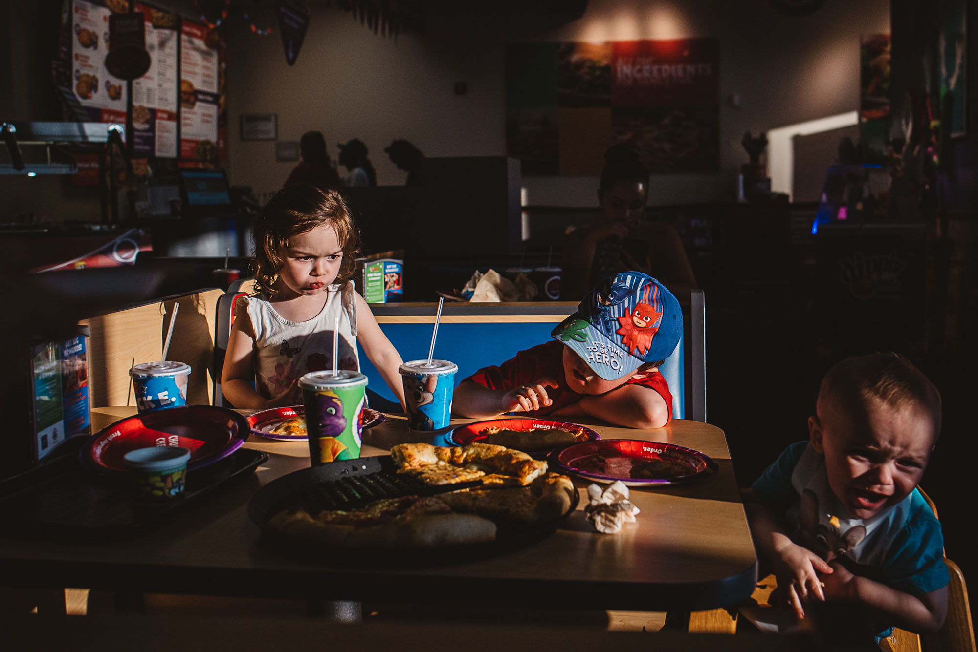
This week we have a critique submitted by Gabriella Hunt. This image was shot with a Nikon D750 and Tamron SP 35mm F 1.8, and the specs are ISO 1600, aperture f/4 and shutterspeed 1/4000.
Critique today comes from Lisa, Leslie, and Jessica.

Lisa: Who knew such beautiful light could be found in a Chuck E. Cheese? Exposing for this light was a great idea to minimize the distracting elements in a busy restaurant. My eye goes directly to the children in the image, and it’s great that each child has at least a highlight on their face so we can read them well. I also like that each child has a different feeling going on. The little girl seems annoyed with her food, the little boy looks bored with his food, and the baby is crying about his food. Each expression tells me a little something about each child’s personality and how they feel about this dinner. You definitely captured the feeling of going out to eat with small children. I like your composition and that you left some negative space at the top of the frame to balance out the busyness at the bottom of the frame. I would like for you to have given a bit more space behind the baby to help us feel that he’s also part of the story and not just someone on the side of the frame (the focus is more on the two older children since he’s out of focus). So, maybe get lower and closer to tighten it up on the left, where the boy in the middle would end up being in the center of the frame. I feel like this will create the feeling that we are sitting right at that table as a participant, rather than shooting at the scene as an observer. It would feel more intimate that way which would create a stronger response from the viewer. But I think you did a great job capturing a fun moment in a less than ideal environment. I know it’s difficult for all the elements to come together for a perfect photo, but I think you did some great problem solving here to achieve a solid image. Thank you so much for submitting your photo for critique!!
Leslie: Great use of light and storytelling in this image. I love the bright vibrant colors and the chaotic mess at the table. The deep shadows combined with the harsh light let us know who you want us to focus on and I love that you can see the silhouettes of people in the restaurant. I can immediately recognize where you are and can guess the ages of the children. The stair step positioning of the kids adds interest and balance to the photo, plus their expressions and gestures really bring the image to life.
To make this image stronger, I would take a slight step back and shift my position to the left to try to create a triangle and eliminate some extra space on the left side. This might also allow you to crop the bright artificial light in the back which is moving my eye to the rear of the restaurant.
Excellent job capturing mixed lighting, story and the essence of what it’s like to dine with young children.
Jessica: Chuck E Cheese is definitely a challenging place to shoot. If I were going I probably would leave my camera, thinking that no interesting light would be available and the setting would be too chaotic. You dispelled that idea! You did a great job recognizing a complex composition and how to make your subjects stand out in a bright, colorful and chaotic environment. At first glance I thought it might be a kitchen table scene. I love how the light creates a tableau of the subjects, and how the eye is led diagonally through the frame following them. The colors are fantastic too- the warmth of the image suggests low summer sun and adds to that sense of hot, sticky exhaustion. I really love the girl’s face and how you caught her in the middle of swallowing or chewing. I wish the viewer could see a bit more emotional response from the boy in the middle- maybe if you shot through this moment for a few frames on either side you would catch some reaction on his face. Overall it’s a great image and you captured what you set out to say.
*****
Interested in having one of your images critiqued? Check out the submission guidelines.