mom yawning and holding baby during Fresh 48 session - Documentary Family Photography

Community Critique – Jenna

Community Critique

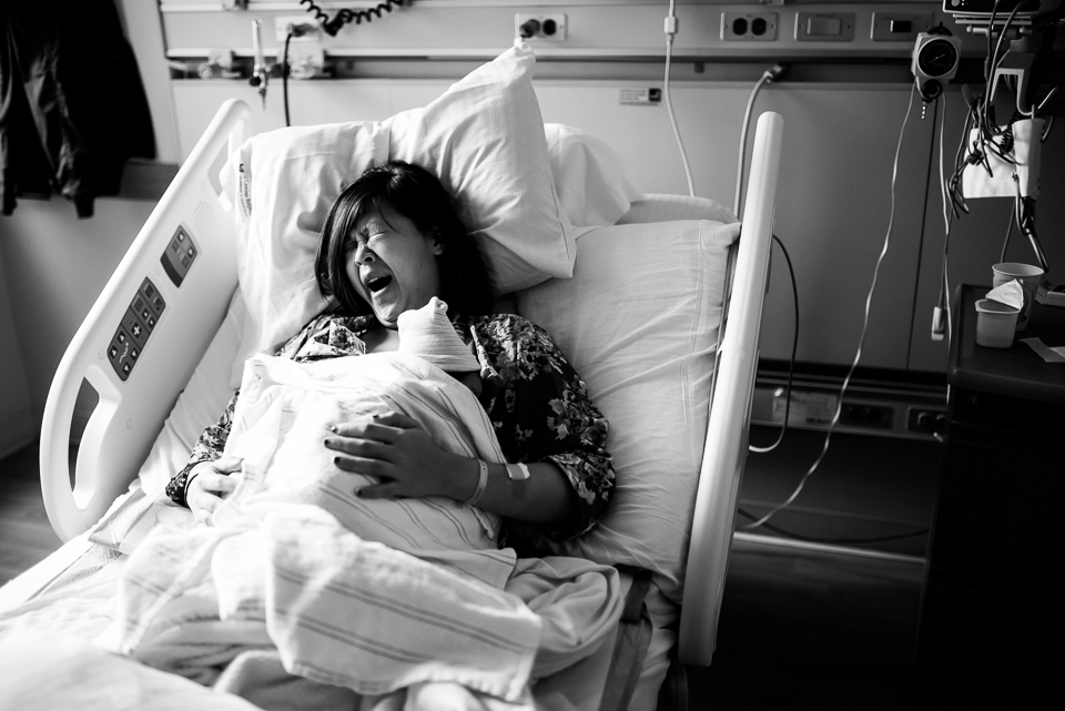
This week we have a new image critique from a Fresh 48 session sent to us from Jenna of Jenna Christina Photography.  The photo was shot on a Nikon D750 using a Sigma 35mm.  Below is what the 3 contributors Jenna selected had to say:
mom yawning and holding baby during Fresh 48 session - Documentary Family PhotographyCelina:
I just love the moment captured in this image, it really depicts how a mom feels after giving birth. The fact that it’s broad daylight adds even more to the story and the beautiful side light definitely helps. It has me wondering if she gave birth early in the morning or during the night.  My eye goes straight to the mother’s face and expression, then my eyes circulate around to explore the scene and I discover the little baby’s head. It wasn’t clear to me that she was yawning at first, I thought that maybe she was in pain or crying. I am not sure if a slightly different expression would have helped or perhaps getting in closer might have done the trick. In a perfect world I would have loved to have seen more of the baby’s face. I realize that changing position would have made it hard to capture the intended story. Perhaps taking the photo from a slightly higher angle would have helped or again by cropping in or shooting closer. That would also we get rid of the wires to the right which I find don’t add to the story and can be a little distracting. I think making the photo black and white was a great choice and the conversion is beautiful. This photo brought so many memories and a smile to my face. Thanks for sharing.

Kym:
​Let me start off by saying what a special time to ​capture! However, I thought at first if she was in the pains of labor, until I noticed the cap on the baby. Her expression is somewhere between mid yawn and crying, which is what confused me. I feel that if you had positioned yourself more towards her shoulder to be able to get a peak of the baby’s face, it would tell the story a little stronger. I love the black and white, but think the shadows, especially around the baby and her left arm, need to be slightly lightened. Also the hot spot on her right hand to the crest of the blanket could be toned down. The exposure on her face is lovely! Shooting in hospital rooms can be tough, and I think you did very well with the composition and framing. You captured visual interest, and a moment any new parent would be happy to have in a birth session.

Natasha:
I like this moment that you’ve captured, it brings back a lot of memories for me & makes me smile. I’m sure that many Mums that see this would be able to relate to this moment – the tiredness of just giving birth. I think that the choice of the black & white conversion is a good one – it brings the focus on to the mother & away from the hospital equipment. I think that if you were to have got in closer, cropping out the cables & side table on the right just to the outside of the bed rail, you could have cut out those distracting elements & made a stronger image. You would still be able to see that she was still at the hospital by the bed & the wrist tags etc, all of that stuff to the right of the bed doesn’t add anything to the story. I really like the light on Mum’s face, it really leads you to her expression. I also like how her face is framed somewhat by the white pillow above her & to the left & then with the white baby blanket & the little hat on the baby’s head. Again, that helps draw the eye right where you want it. I think you made a good choice with the DOF that you used. The highlights are a little blown on the baby blanket & kind of compete with the light on the pillow to draw your eye away, so I would burn them a little if you could.
If you’d like to have an image critiqued by 3 of our contributors, head over to our Submissions page.
kids hands over top play house playing with toys

Community Critique – Allison

Community Critique

We are so excited to bring you our first critique feature from Allison who shoots with a Canon 5d markii, sigma 35mm art lens, 50mm 1.4, and a macro lens.

kids hands over top play house playing with toys

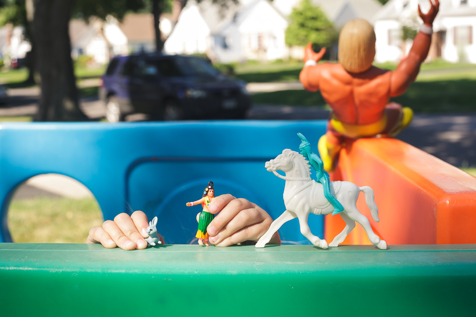
I love the small area of focus. I think that the choice of aperture is spot on for this type of image. I like the soft spotlighting happening on the hands and toys in the focus area. The dappled light helps with the feel of the image without the harshness of full sun images. I find that the orange toy in the top right corner is a distraction – the lines of the fort/play gym are awesome leading lines however they lead to the out of focus toy which takes my attention from the main component of the image. Maybe a slightly different angle or perspective may help to minimise that effect. I would have liked to see the focal point (hands and toys) drawn up a little in the frame – more onto the bottom third line as some of the other elements in the image draw attention away from it rather than drawing attention to it.
I really like the colour palette in the image. I find that the colours are all beautifully complimentary. The car in the back ground isn’t detracting from the image. I think the blur of the background helps with that.
The only thing I would change to create a stronger image would have been to remove the orange toy as it would have left cleaner lines drawing you through the frame back to the hands. But overall a good storytelling image of a child lost in his/her imagination and having an outside adventure.
First off, let me commend your creativity with this shot! It is not a standard image, which is something I love. It’s great how it tells a story that is so particular to childhood. The brightly colored play structure is abstracted, yet still easily identifiable and the mismatch of toys pushes us to create a narrative.  There are some things I think you could do next time to help make this image stronger. It looks like the highlights on the houses in the background are blown. This is a common issue with shooting digitally and for this reason I will often underexpose in camera (so that there are no blown pixels) and then bring it up in post so that I can maintain a greater dynamic range in my photos. Eyes naturally tend to go first to the brightest part of a photo, so in this image the background is competing for attention with the action in the foreground. Along those lines, I would also get lower so that you use the play structure to block out the car, as it also draws the eye and, thus, distracts from the narrative you have created in the foreground. I would also try moving just a bit to the left, which would move the hands to the right, so they have the clean background of the blue wall behind them. As it is now, the hand holding the bunny has the window cutting through it and if that was separate it would help add to the graphic punch of your image. My personal preference would be to not do matte processing on the image. I think the colors could be that much bolder without the matte look applied. For my own work, if I want an image to be matte, I will still process it the same way I would any other image with true black and white points, but when I print it I will use a matte paper.  You have a great use of color blocking. I would really love to see you push yourself even further next time and use the bright colors of the play structure to fill the frame and guide the composition.

I like this photo! There is a color, humor and an interesting perspective in choosing not to show a face. The odd mixture of toys captures the quirky little things our kids do. Your shallow depth of field helps to isolate the subject of the hands and toys and draws my eyes there rather than to the distracting background. There is a strong diagonal line that starts in the top right corner and leads my eyes all the way down to the hands. I also like you how used the solid blue background as a contrast to the hands otherwise the they could have been lost with all that is happening in the background.

I think one thing you could have done to improve this photo is take one small step to the right to get some separation between the white horse/blue indian and the toy (Hulk Hogan?) in the back ground.