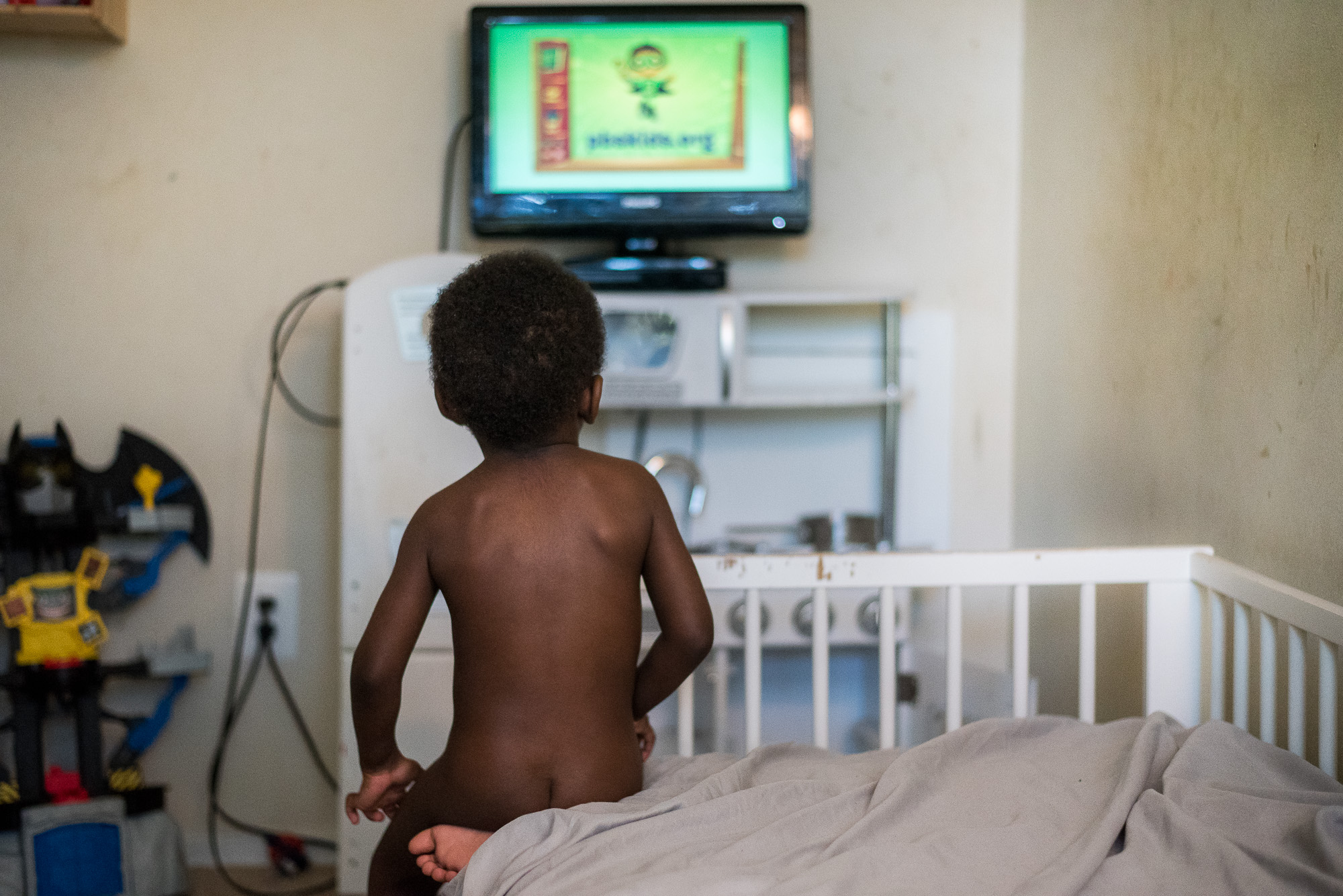
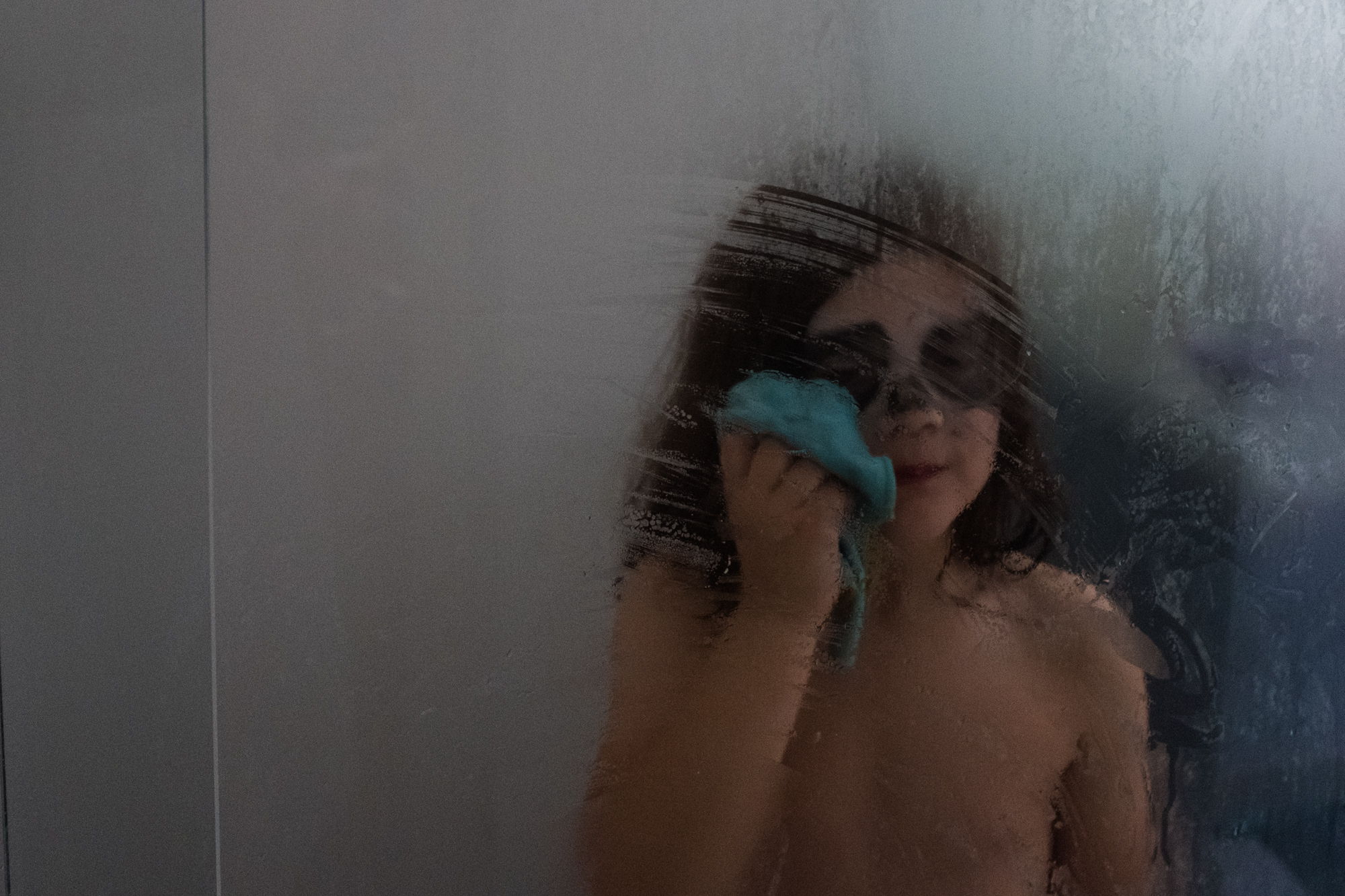
This week we have a photo submitted by Alice Pinetti for critique. This image was shot with a Nikon D90 and AF Nikkor 28-105 f/3.5-4.5D, and the specs are ISO 3200, aperture f/3.8 and shutterspeed 1/50. Alice explains, “Ennio just loves to be part of everything that goes on in our home and the daily shower is his favourite moment. Finally free of every garment he climbs up into the shower to take his part in Amelia’s water games.”
Critique today comes from Felicia, Leslie, and Jenny.
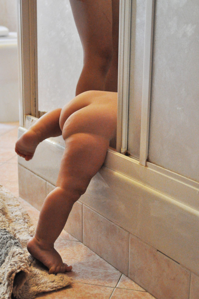
Felicia: Alice, it is clear from your description of your image that this moment is really meaningful to you! First, good job on shooting in the bathroom in ambient light! The white balance seems to be close to what it would have been in reality. The other thing I noticed about this image is the amount of digital noise it has. I am looking at your Camera and settings and see that with the D90, you are probably pushing the limits on ISO at 3200. It’s actually commendable that you managed to freeze as much as you did of Ennio’s motion at 1/50!
Shooting a photo in portrait orientation is not as common as landscape because our eyes like to read across, from L to R. If you are choosing to shoot in portrait, it would be for reasons like accentuating/emphasizing the vertical height of some elements in the frame. In this case, I don’t know if it is necessary to shoot in this orientation, or if shooting landscape would mean chopping off Amelia’s legs or Ennio’s feet because you are on a crop sensor and it’s too tight. But if you can when this happens next time, try shooting landscape and think about including some of the garments that Ennio’s left behind (if it’s on the floor) or square up facing the shower door so that you can capture more of his body language to show his effort in getting in to the shower. Maybe his arms trying to balance on the other side of the door, or his and Amelia’s facial expressions (unless you are intentionally trying for anonymity!). Diagonal lines like the ones you composed for can be effective leading lines but with a portrait orientation, they get truncated so their effectiveness is short-lived. The good thing about this moment is that it will likely repeat often, so you can keep working to get different perspectives on your shots!
Leslie: Alice, I like that there is a sense of mystery in this image. While, I’m usually a big fan of faceless images because they are intriguing, I think this image might have been stronger if you had captured a bit of Ennio’s face or hands. It would have added a bit more interested to the image and allowed the viewer to identify more with what is going on. Your choice of shooting in portrait orientation is drawing my eye upwards when I think your intent was to get me to focus on him getting in the shower.
That being said, I love that you have this image to look back on and remember this every day occurrence. If you want to try again, I think an interesting perspective might be to capture shoot from outside the bathroom door or use the bathroom mirror. Reflections are a great way to add visual impact to the story and I especially like them for more intimate moments.
Thanks for submitting.
Jenny: Alice, I love that you captured this! My daughter used to do the same thing as a baby and it was the sweetest, so I know firsthand that this will be such a great memory in the years to come for you, Ennio and Amelia! I know bathrooms can be tricky to shoot in with both space and light, but you’ve done a great job here with pushing the capabilities of your camera. I’d be interested to see this in black and white and if that would help a bit with the noise. Had there been colourful clothes on the floor, or baby toys, or anything with colour that added to the story I would keep it as is, but I don’t think that the colour is adding anything here and black and white would’ve been my first choice.
I’m predominately a horizontal shooter, and really only turn the camera vertical if I want to emphasise the height of something, to highlight specific lines, or if I really can’t get everything to fit horizontally that I want in the frame. Space may have been the reason here, but if you were to try to shoot this scene again (which knowing babies and their repetitive behaviour, you probably have the chance most days!), I’d aim for landscape and try to add a few more details into the frame.
Great job, and gorgeous memory captured!
*****
Interested in having one of your images critiqued? Check out the submission guidelines.
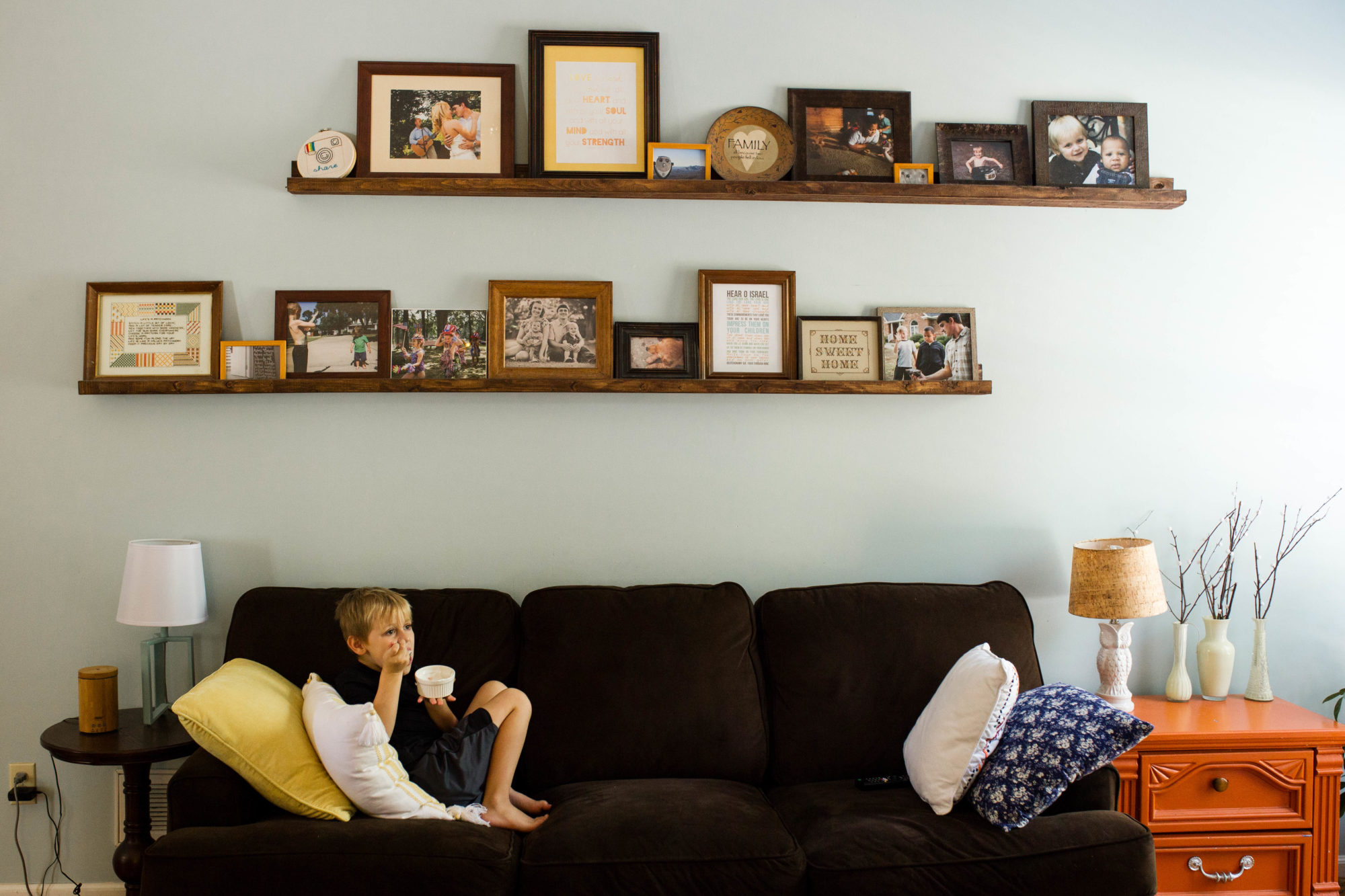
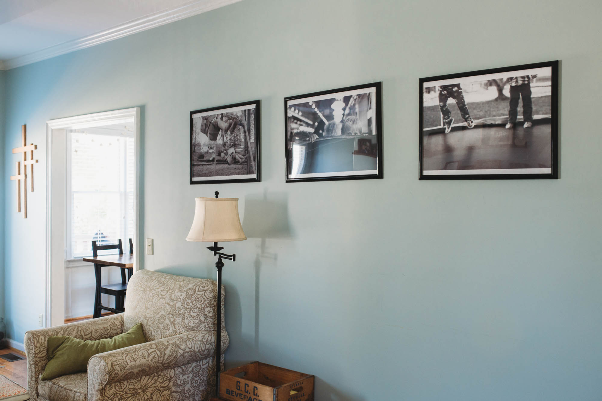
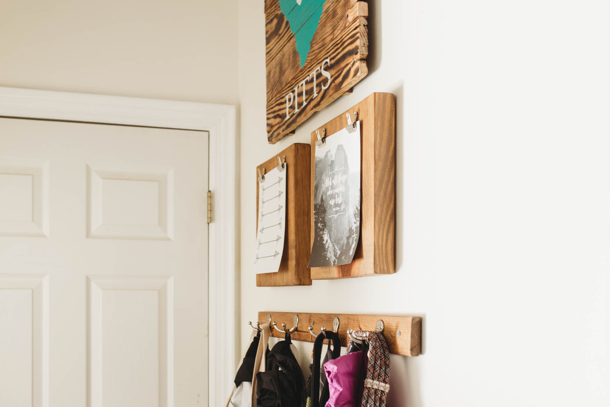
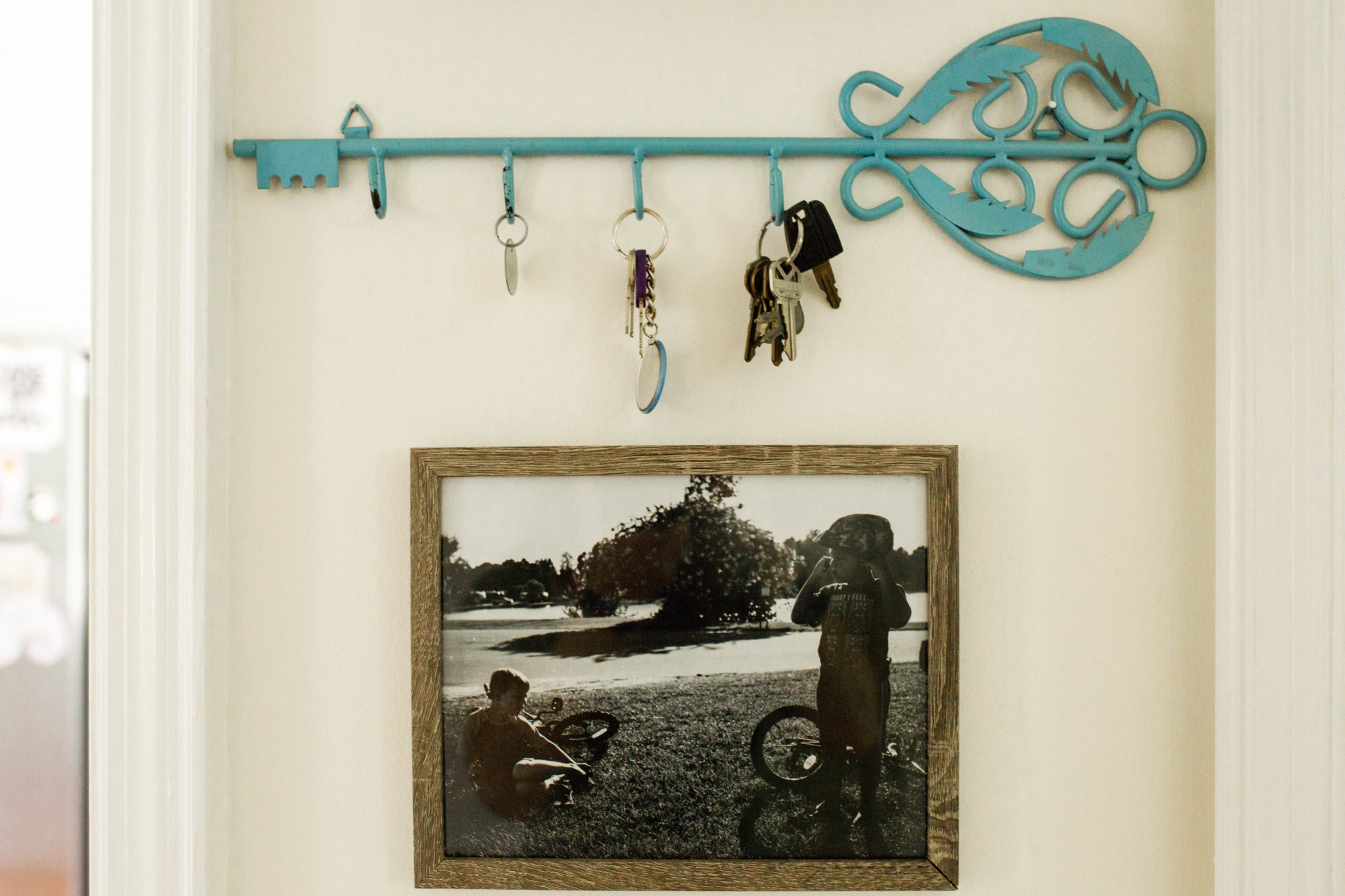
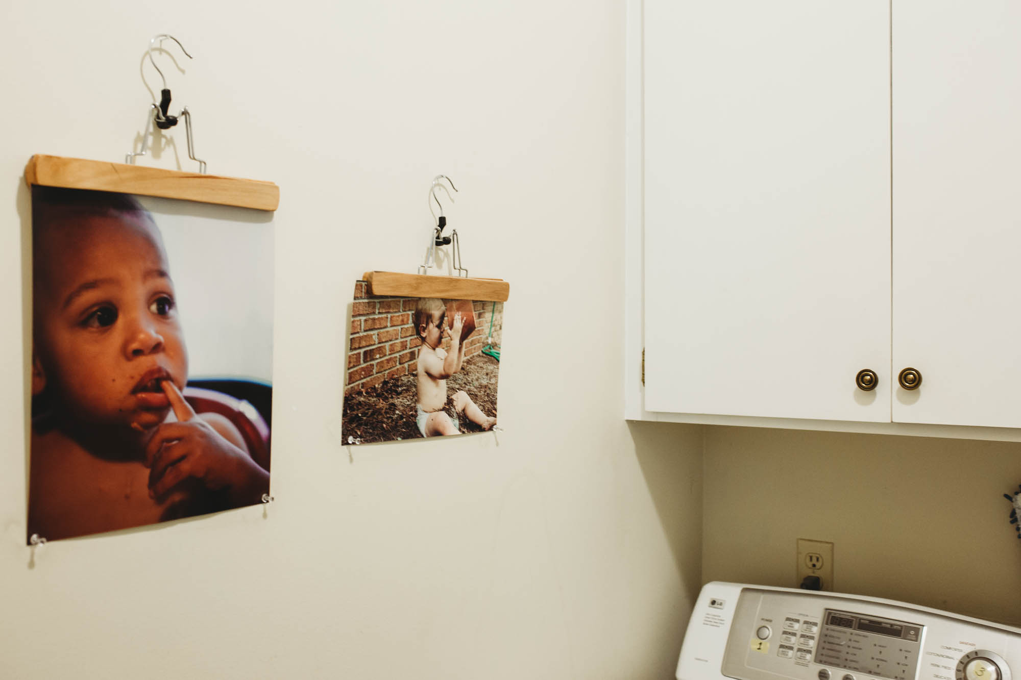
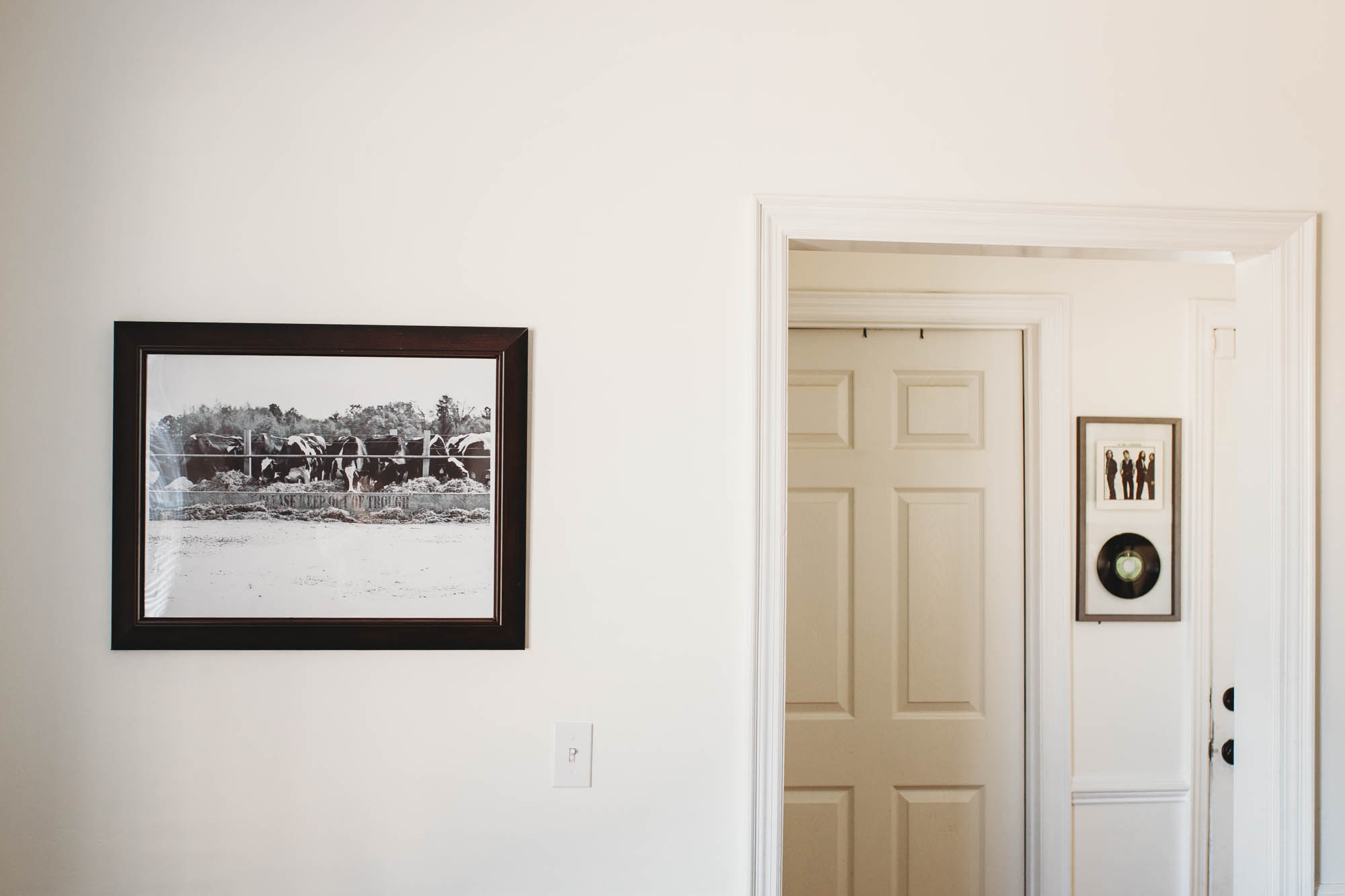
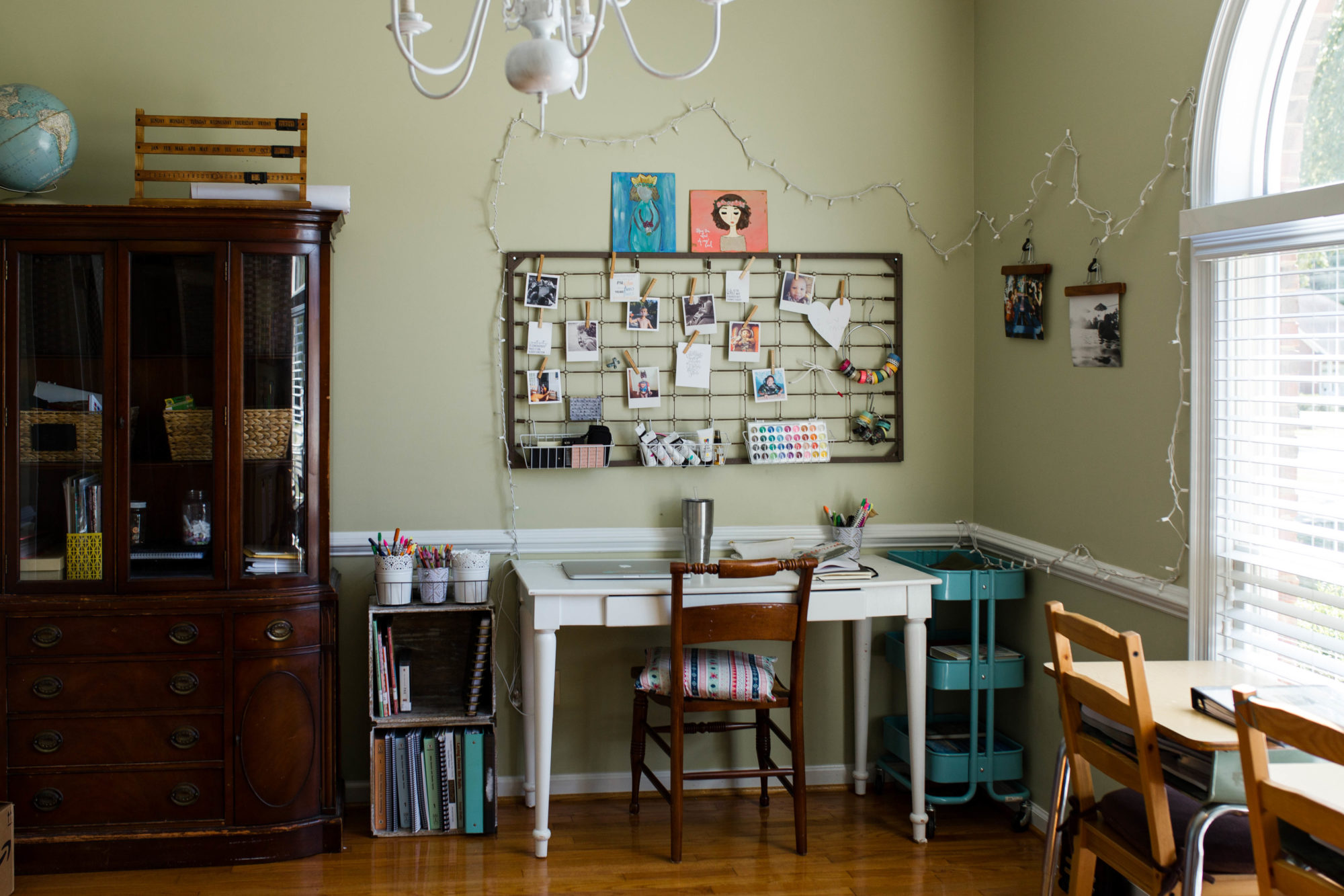 We’re going to go on a little home tour of sorts today, as I show you some of my favorite ways to display our photos.
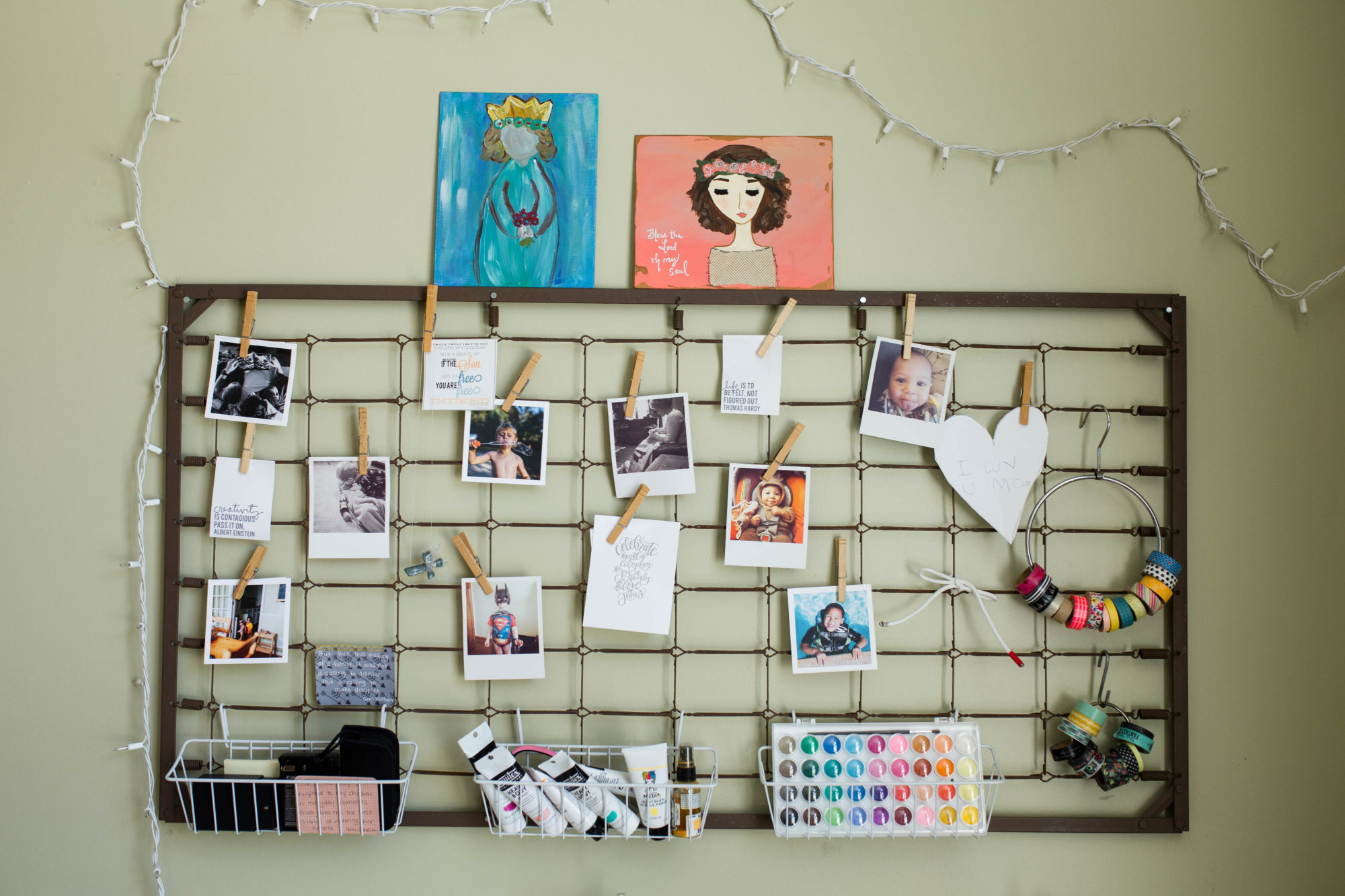 Those photos are some of my all time favorite photos of my boys in their early years. I change around a lot of the prints in our house, but those images will stay there. They are grounding to me. They remind me that even though the boys are growing, they were once tiny little creatures who needed me so much. When I look at them, they make me smile. They also make me remember to never take these days we live for granted.
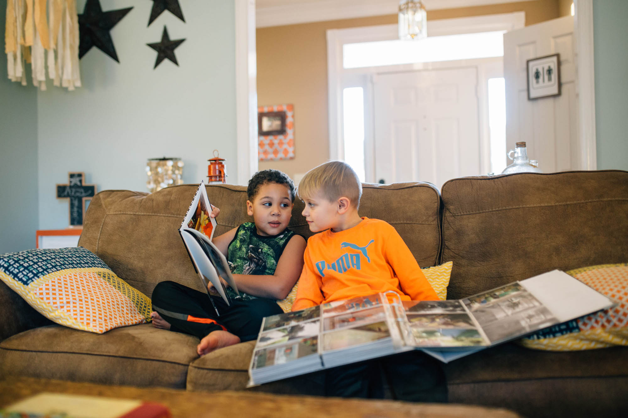
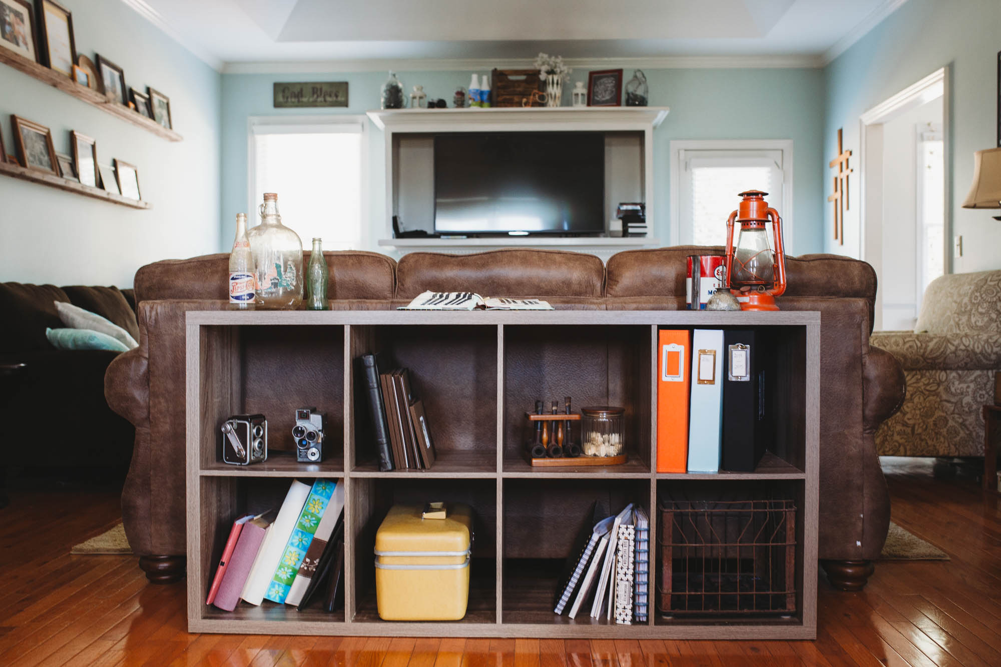 One of the main ways I print and display our images is in photo albums. I pretty much print every single image I edit that I’ve taken of our family. Might be a little overkill but oh well.
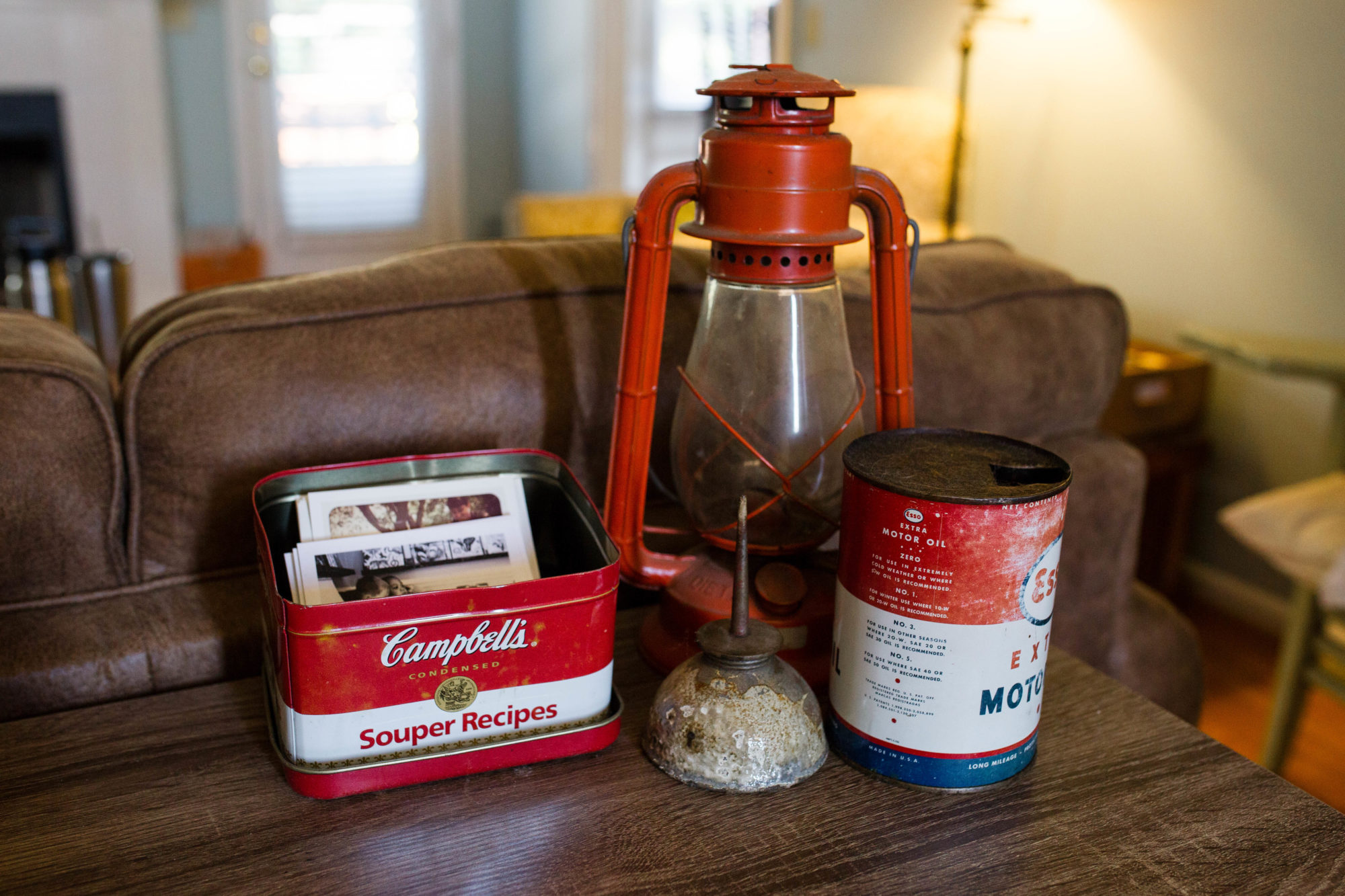
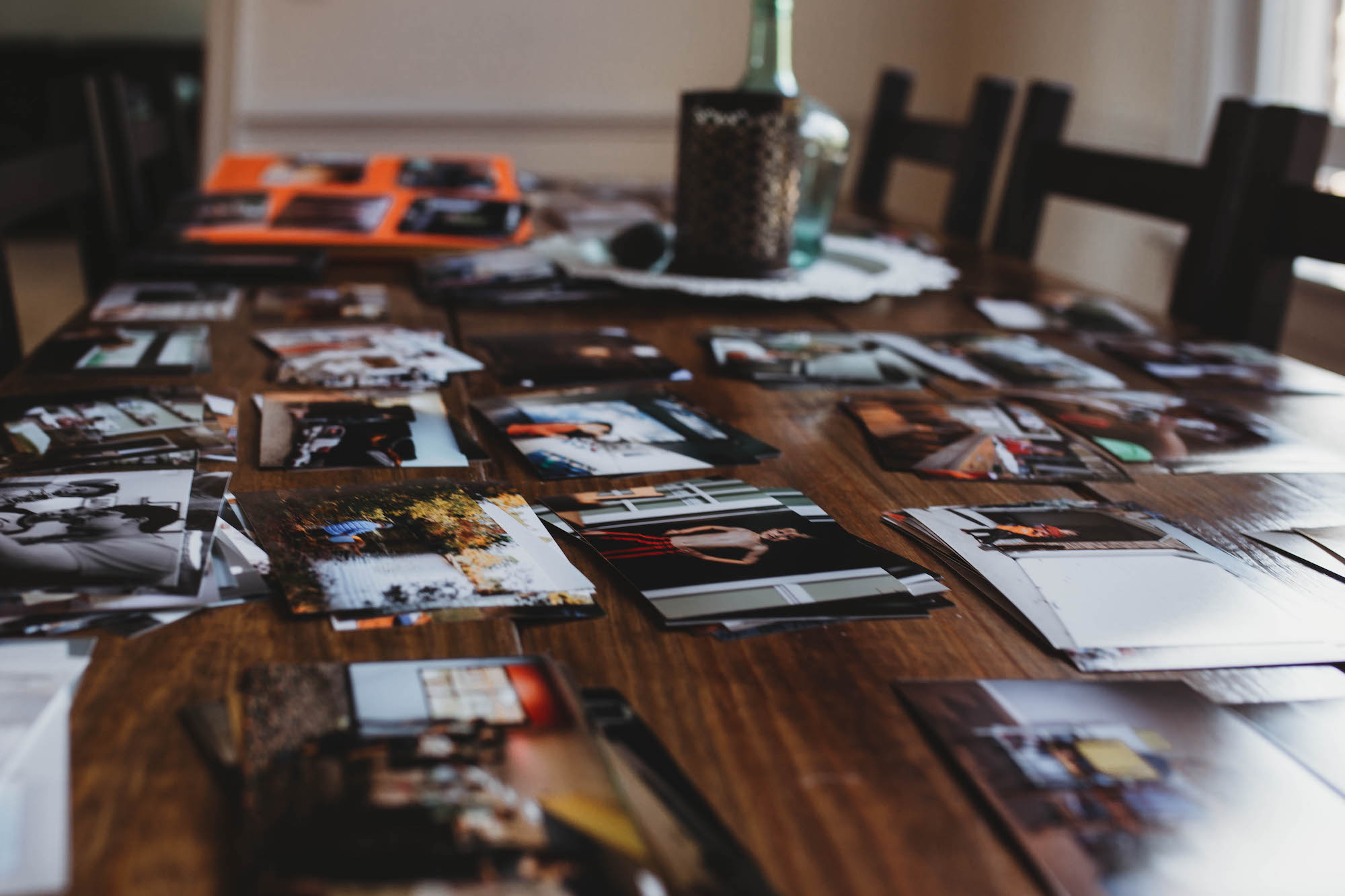 This is what “print day” looks like. My print lab usually does a quarterly sale on 4x6s so I do a huge order and put them all out on the table to organize them before I put them in the album. The boys love looking through the photos as I pull them out of the packages.
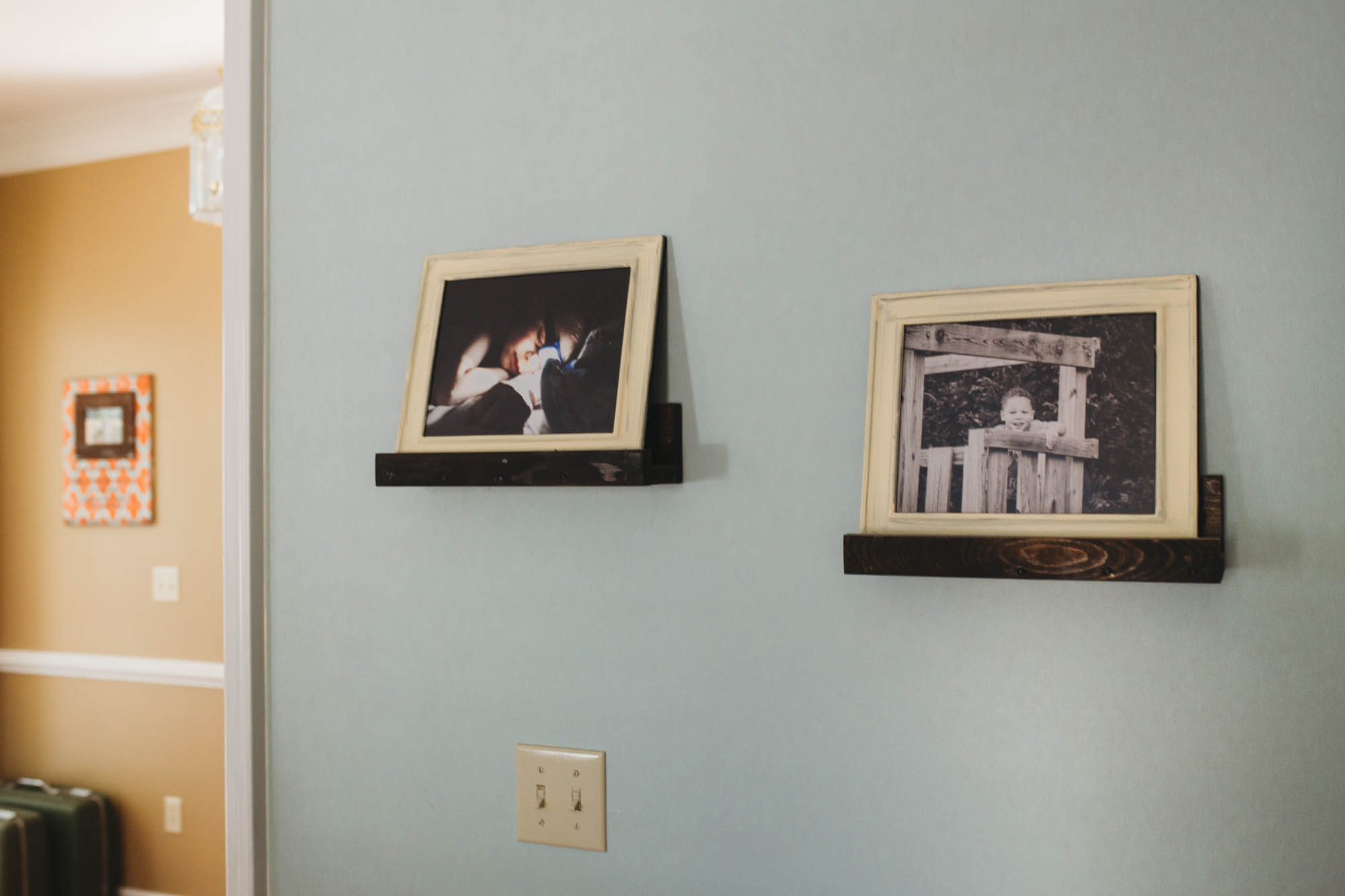 As I was building the photo shelves, I had some remnant wood… can’t let that go to waste! These hold single 8×10 frames along another wall in the house.


 Jen Smith