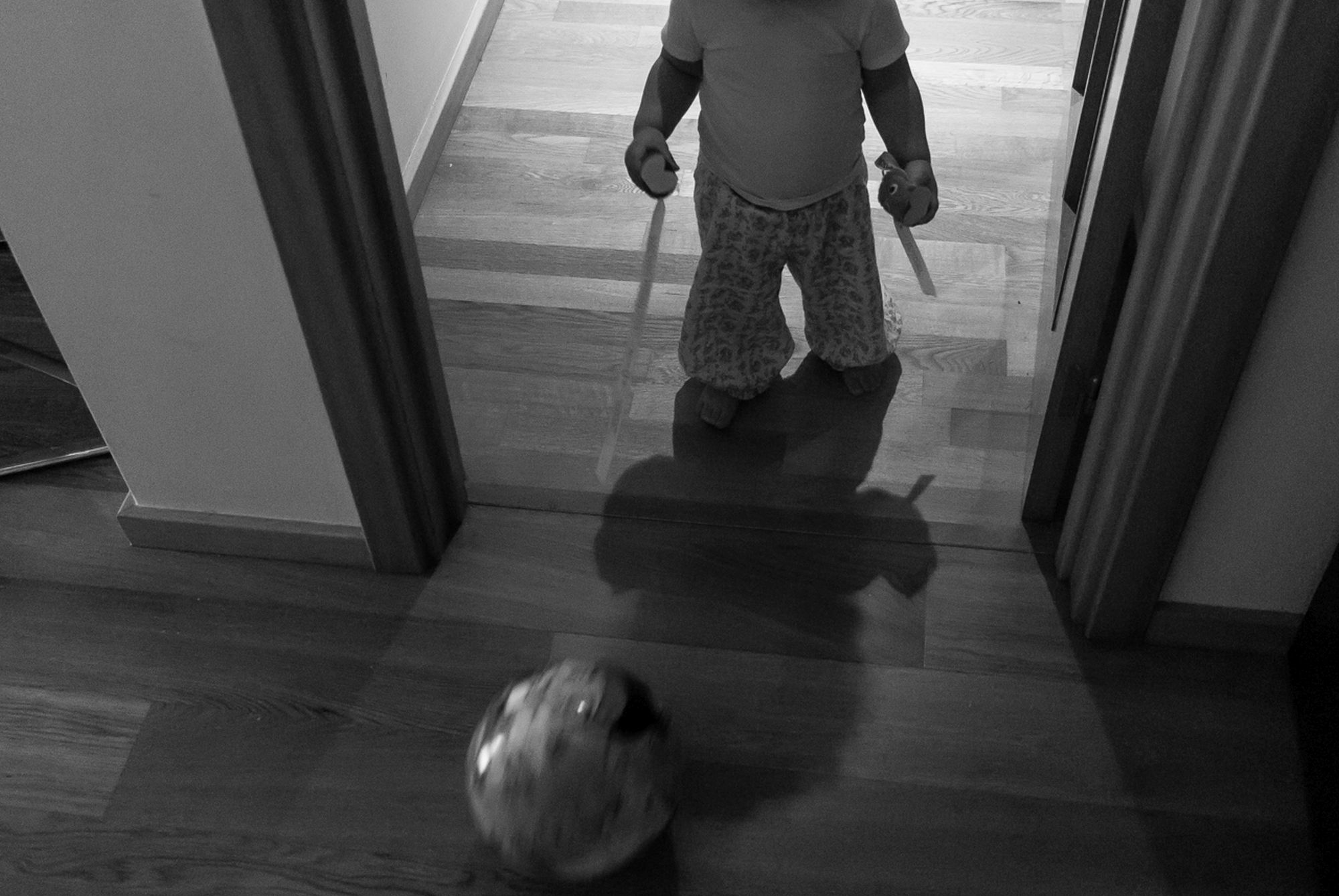
This week we have a photo submitted by Nuno who is working on a project called “Explorations” which is about photographing his daughter as she explores throughout their house . This image was shot with a Nikon D200, ISO 500, f3.3, and SS 1/80.
Critique today comes from Heather, Celina, and Robin.

Heather: What a sweet image of your little one. I love that you converted it to black and white. It helps focus the mood and brings your attention to the baby. I am a huge fan of shadow images. I think that I would like to see the whole body in the shadow or to see the face. I like that you used the door for framing the baby.
Celina: What a great idea for a series, I am sure you have plenty to document especially at this age. I love that your daughter has something in both hands and is kicking a ball all at once, it really emphasizes the exploration theme and chaos that comes with children. The lighting makes it feel like it’s really early in the morning or later at night which really adds to the story of the busy toddler always on the move no matter what time it is.
Personally, I am curious to see what expressions she has, I think that could have added to the story. Things do move quickly, but I would have tried to crop her a little lower at the shoulders or one idea would have been to take the photo from a higher angle and maybe tried to get more of her shadow and put emphasis on the ball even more. I do love the motion blur of the ball, it adds movement and a sense of urgency. I love a black and white picture but I am really curious how all the toys would look in colour. I am really looking forward to seeing more from this series and how it evolves as she grows.
Robin: I love the idea for your project! One of the first things I notice about this photo is the motion of the ball. I like that you chose a slow enough shutter speed to keep your child in focus but still captured the motion of the kicked ball. Using the doorway as a frame for her works well, too, and it draws my eye to her and the ball. I am normally a fan of images without a face, but I think seeing her face might have added a bit of interest to this photo – especially if she had an interesting expression (like excitement or concentration) on her face. I wish I could tell what she is holding in her hands, and I find it a bit distracting that I can’t figure it out. I’m curious if it would been easier to see what’s in her hands had this photo been in color. I think squaring up with the doorway would have helped and possibly have allowed you to get rid of the distracting elements in the left side of the frame. If the setup of your house allows for that (I get that squaring up or backing up isn’t always an option), I would try a shot again like this and aim for more horizontal and vertical lines.
*****
Interested in having one of your images critiqued? Check out the submission guidelines.