This week we have an anonymous critique, and this image was shot with a Canon Mark III.
Critique today comes from Felicia and Lacey.

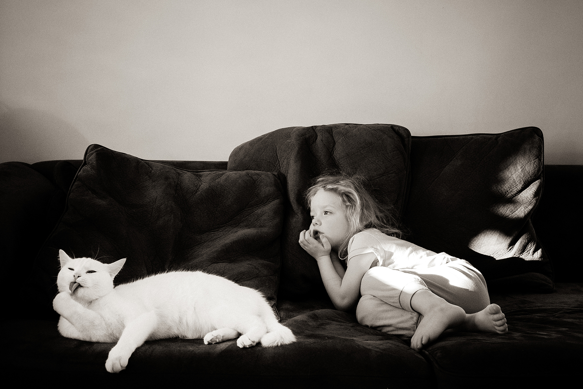
Felicia: For me, this image captures my attention first with its mirroring in posture. The way the cat and the girl are positioned with their heads to the left side of the frame; it brings an implied line to read in that direction. As eyes are trained to read from left to right, this introduces tension to the image.
There is a bright spot to the right of the frame that is distracting and understandably challenging to manage because of the white cat, without losing the texture of its fur. Exposure is managed well in this case as the cat’s highlights are not blown. Unless the girl moves out of this bright spot, it cannot be eliminated from composing the frame without compromising the significance of the mirrored postures.
Compositionally, I do think you could have gotten closer to eliminate a lot of the space around them as it doesn’t serve as effective negative space or add context to the image.
As strong as the mirroring in posture is, and the suggestive states of rest and relaxation between the girl and the cat, the moment itself is not a loud one. To me, I am intrigued with the far away look in the girl’s eyes, and it makes me wonder what she is thinking of, or where her thoughts are, although that gesture is seeminly unrelated to the cat cleaning its paw. In that way, the subjects are not connected or reacting towards each other, any more than their postures are mirroring. I want to see a moment that tells me something more about their relationship.
The choice to convert to black and white and the warm tint for processing is unclear to me. I am curious about the child’s wardrobe – are the colours going to be able to add more to the story of her as a subject? Are there subtle stains that add more information?
For me, this image leaves me wanting to know more about their relationship so I would ask, if you had to reshoot this, how can you shoot this differently to say something about their relationship?
Lacey: First off, I love the mirroring you were able to capture in this photo! Great eye! The conversion to black and white works well for this image as it further cements the repetition between the cat and the child. They become a matching pair in their light tone with dark mouth and eyes. Getting down low to eye level helped them be fully encompassed by the dark field of the sofa behind them. If you had been at a different angle where one of them broke the horizon line of the sofa the photo would not have the same effect. It looks like the image may be overexposed slightly. It appears that the light that falls on the child’s clothing is a bit overblown. I would recommend shooting at lower exposure to retain that information and then using some light dodging and burning to help equalize the high key area. Our eye as the viewer is drawn to the lightest area first, which is great as that bring emphasis to the child and cat, but it is not great for drawing the eye to the overblown shirt and pants and light area of the couch. Overall this is a strong photo, and utilizing the adjustment brush in lightroom to take care of the hot highlights will make it even better.
*****
Interested in having one of your images critiqued? Check out the submission guidelines.