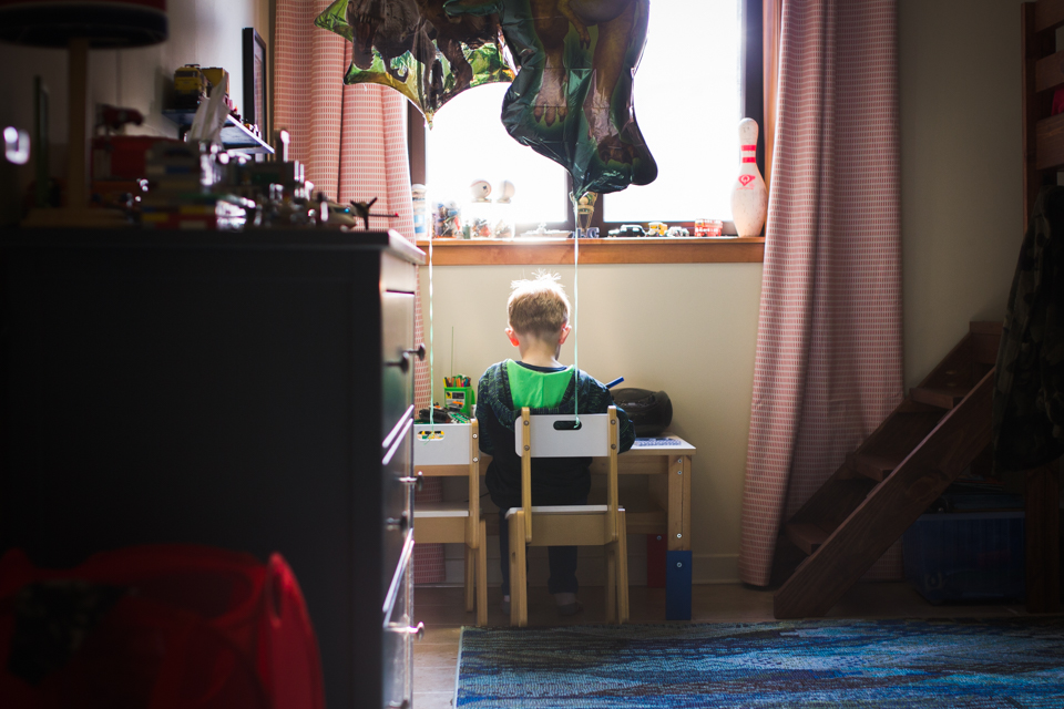
Today we have an image critique from Katy who describes herself as an hobbyist photographer who is trying to learn is all. Katy has this to say, “I currently live in South Korea with my husband and two boys. My goal is to capture moments…real moments that will bring tears to my eyes many years from now.”
Katy captured this image using a Canon EOS Rebel T2i and a 35mm f1/4 lens. The specs are SS 1/160, f/2, ISO 200.
Critique today comes from Natasha, Jessica, and Lacey.

Natasha: This is a sweet quiet moment of your little boy. I like that you can see all of his belongings around his room, the way he is rocking forward on his chair. The framing of his head below the window sill is good & I like that you can see the texta in his hand, so you know he is drawing or colouring. I feel that this image would have been stronger if it was shot from a different position or perspective. Perhaps if you had stood on top of those steps to the right of the frame, or(what I’m assuming is) the bunk bed so that you could get a side view of him, being able to include the rocking forward on his chair, what he is doing as well as the look on his face. The highlights at the top of his head could be brought down a little so that you could see more detail of that little tuft of hair he’s got going there. Overall, this is a sweet photo to have of your child.
Jessica: I love that you are yearning to capture the details of your family’s life in a way that will move you in the future. The environment of the room here and the stuff on the dresser and window ledge, even the balloons, certainly all tell a piece of this particular story at this point in time. I like that you got low to shoot this, and that you used the dresser as a foreground element. The light here is beautiful, but I think it would be even more stunning if you shot it from the side- maybe from the stairs to the right of him. If you see light falling on a face, pay attention! If you had included his face at side view and the details on the desk, he would have been beautifully illuminated and the background would have darkened down around him, creating a lot of drama and mood. You would still be able to capture the context of who he is and what he is doing, but it might have been a more emotionally moving photograph. Also, it’s not always possible, but when you have a large light source like the window casting light onto a darker indoor scene, try to capture the light without including the light source (ie shooting from the side and exposing for the highlights on his skin). The colors and editing here are beautiful, and I’m sure he will treasure this little piece form his childhood.
Lacey: Thank you so much for sharing this image with us! Something that I think you managed really well in this photo is the use of repeating color. The red in the drapes forms a triangle in the composition as it connects visually to the red hamper in the front left corner. Then the green forms another triangle from with the two dinosaur balloons, the green of the boy’s hood lining, and the objects on the desk. The only other strong color represented in the photo is the blue of the rug, table leg, and the pen in the boy’s hand which also help form a compositional triangle.
I think the photo could be even stronger if you got down lower but angled up a bit so you could keep the straight on view, but show more on the top of the image. I would love to see the dinosaur balloons fully included in the image. I also would be interested to see what this image would like if you lowered your exposure so we could see what was outside the window. As your son is sitting so close to the window I would expect that we would have light softly spilling in and outlining and defining him as the rest of the image falls into shadow.
Keep on learning and enjoying photography! These images will be treasured by you and your son as a reminder of this time in your life living abroad.
*****
Interested in having one of your images critiqued? Check out the submission guidelines.