“Nothing is absolute. Everything changes, everything moves, everything revolves, everything flies and goes away.”
-Frida Kahlo

“Nothing is absolute. Everything changes, everything moves, everything revolves, everything flies and goes away.”
-Frida Kahlo


“The moment was all; the moment was enough.”
-Virginia Wolf

“The true sign of intelligence is not knowledge but imagination.”
– Albert Einstein
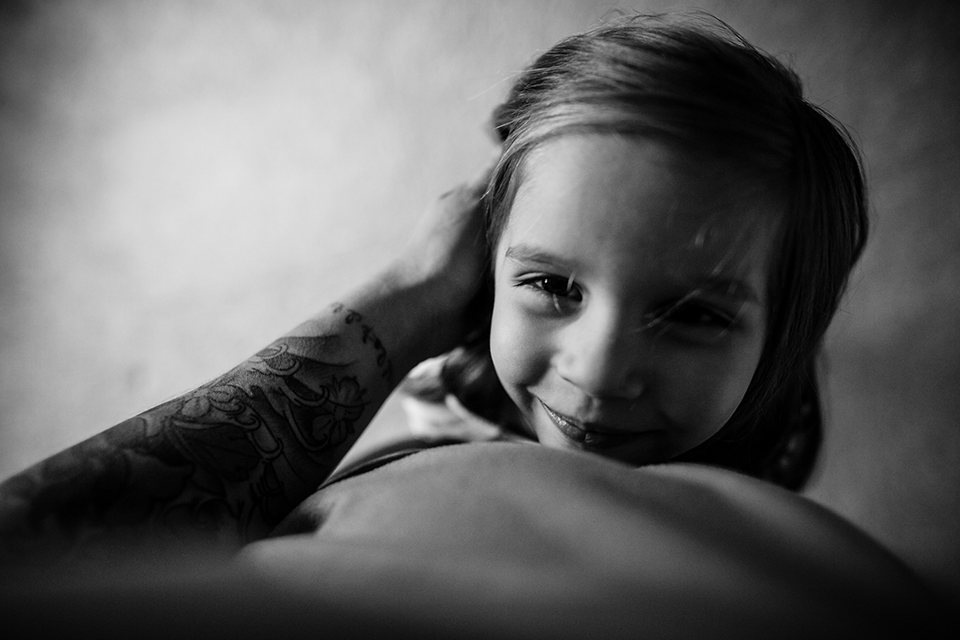
Today we have an image to critique submitted to us by Bonnie of Bonnie Hussey Photography. This image was shot with a Canon 6D and a Sigma 24mm f/1.4. Critique this week comes from Jessica Uhler, Lacey Monroe, & Natasha Kelly .
Jessica:
I love the moment you captured here- it is intimate and specific and shows so much of the girl’s personality and the uniqueness of her facial features but it’s also very relatable to other parents. I love how she has a little curl of a smile. Usually I don’t like shooting down and kids, but in this case the perspective highlights the relationship of the child to the photographer- a closeness, a comfort.
I wonder what this would look like in color. I think the tattoo could add interesting texture and context to the story. I love the contrast and warmth of low-light color images and I think it could make this image much more interesting. The composition has a lot of negative space, and the perspective gives it almost an abstract quality. I wonder if you could have included more details in the frame to tell a bit more of the story- location, texture, inside, outside, etc. The lack of depth of field does isolate the subject and make this image more of a portrait, but it is a portrait of a relationship and I wonder if you could have stopped down a little to allow the viewer’s eye to go deeper into the frame. Also, the right side of the frame feels a bit too dark. Try bringing up the shadows a bit so we can see some detail there.
I like how your arm creates a diagonal line into the frame and connects the subject to the viewer/photographer.
Great job making this image!
Lacey:
This is such a darling photo that tugs on the heartstrings of any parent. The utter love and adoration you capture in the little girl’s face is something that a parent will cherish more and more with each passing year. Having the hand in her hair reinforces the connection between parent and child, as well as, it is a strong diagonal to guide the eye in the composition. The soft light that is reflected back onto the shadowed side of the child’s face is quite lovely and adds dimension that might otherwise have been lost to the dark tones of the hair.
There are few things I would suggest to try next time to make this even stronger. I would angle the camera slightly up to cut off the blurred body part at the very bottom of the image. The blurring interrupts the strong compositional line from the arm. I would also take back the vignetting a touch. The right side vignette looks very natural with the fall off of the light, but the top left corner is noticeably darker than the surrounding areas and that contrast pulls my eye away from the intended focus of the image. The last thing I would say you could try is to give the photo more context. As is the background is completely out of focus and clear of environmental details. I would guess it is inside on carpet based on the soft modulations in grayscale, but if you were to stop down a bit and show some of the background it could give the photo more of a sense of place. All in all, a lovely picture that any parent would be happy to have so they may be reminded of just how dearly they are regarded by their little ones.
Natasha:
This is a really sweet moment capturing a sweet expression, & I’d say it would be a universal moment for parents – we could all relate to it.
I like that the photograph includes the photographers arm, which helps lead us into the picture. I would have liked to have seen more light on the right hand side so that we could see both of her eyes. I would have also liked to have seen a greater depth of field. I think that if you had stopped down a little more, say to an aperture of 3.5, we would have been able to see more of the little girls face in focus & that would have made for a stronger image.
I do like the composition & perspective of the photograph. Leaving a little more room between the top of the little girls head & the top of the frame would have given the photo a little more breathing room without changing the intent of the photographer. I would have liked to have seen what this photo would look like in colour – to see the little girls eye & hair colour, the colours of the tattooed arm, I think this would have added a bit more depth to the photograph.
…
Interested in having one of your images critiqued? Check out the SUBMISSION GUIDELINES HERE.
“We are what we believe we are.”
– C.S. Lewis
