“If you get tired learn to rest, not to quit.”
– Banksy

“If you get tired learn to rest, not to quit.”
– Banksy

“Come with me where dreams are born, and time is never planned.”
– J.M. Barrie
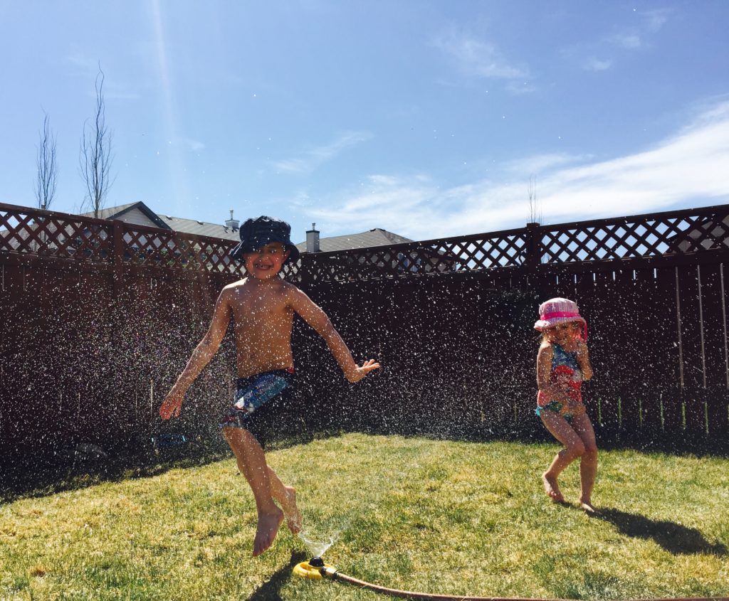
This week we are critiquing an image from April, a mother of 6. She submitted this image that she shot with her iPhone 6, which goes to show that the best camera is the one that you have with you. She selected Jodie, Gemma, and Jessica to give her critique. Below is her image along with our contributors had to say.

Gemma:
I immediately feel the warmth and hear the giggles just looking at this photo – it’s a pure joy moment! And how many times have we all watched kids run through sprinklers? It’s such a classic summertime activity that I’ve photographed with my own boys on many occasions but can’t ever get enough.
First off, I like that this isn’t a typical 3:2 ratio crop – this may also work well as a square. If there’s any way to adjust a touch to the right of the frame to get her whole shadow, (which would only cut out a touch of the fence on the left of the frame), I’d give that a try. Showing her whole shadow should give just a smidge of better balance because he is so large on the left side and her + her full shadow will be close to the same proportions. The exposure is great for bright mid-day sun and I really like that you’ve retained the blue sky because it really adds to the summer feeling. You made a smart choice of shutter speed to freeze all of the droplets of water spray and the movement of the kiddos as they are running through them. I also like how both subjects are in focus, so great job with selecting an appropriate aperture for the scene. Their expressions are priceless (and I want to see more!!). This is an easy fix by taking a small brush in Lightroom to lighten the shadows in their faces just a tiny bit. In this situation, the only thing I would have done differently is try to get a tiny bit lower to make the fence block the tops of the roofs in the background. My eye does get pulled back to shapes – the triangle and rectangle – when I really want to look at the action happening in the foreground. That would have also made his jump appear a little higher in the air as well, which is always fun!
Jessica:
First of all, I think the colors in the image add to the story of the moment- bright summer sun, childhood, happiness. The moment and gesture are good. I like the directional tension of the boy moving one way into and through the water and how his hand leads backward to the girl who is moving away from the water. The position of their bodies and the angles of their limbs help create visual interest and movement in the frame.
The composition could be stronger. I do like the leading lines of the fence and the grass line and how they create strong diagonals leading the eye in to the frame, but since they intersect with the boy’s head they become a distraction. If you had gotten down lower and shot up toward the kids several things would be accomplished: the boy’s head would be against the clear negative space of the sky and the children would become larger in the frame, making both them and the moment more dramatic. Another option would be to stand on something and shoot down on them, so that they are contained within the frame of the grass.
I think a bigger aperture might have worked better as well. I’m guessing this was shot at a fairly small aperture- maybe f8 or f11?- because of how much depth of field you have all the way back to the rooflines behind the fence. I think stopping down just until the two kids were in focus would make the frame feel more intentional and help the viewer’s gaze.
Another thing to experiment with is slowing your shutter speed to convey movement. It would create a totally different look and feel to have the water and children a bit blurred, but since that movement is so much a part of the story it could make for an interesting and emotional image. Sometimes the most technically accurate or sharp image isn’t the one that truly represents the feeling of a scene.
Overall I think the exposure, colors and moment are good. The image is full of the joy of summer as a child. With some practice changing your perspective you can strengthen the story of images you make.
Jodie:
I love the leading lines in this image! they bring your eyes through the photo perfectly. The rays of the sun help lead you into the action within the photo then the fence leads you left to right.
The placement of the children is great! They are clearly together yet with the separate actions captured are still individual! Their expressions are gorgeous! it really is a fun image and tells the story of how much fun running under a sprinkle really is!
your exposure is great. I may bump the shadows slightly to lighten the kids faces but you can still see all their details clearly (including the lost tooth gap! that is awesome!)
The pop of the pink in the girl’s hat and swimmers breaks up the cooler tones of the blues and greens in the sky and grass and the darker tones of the fence. her placement using the rule of thirds is yet another component to this image that really makes it work.
Overall, I love this image! its such an iconic fun summer day under the sprinkler and has captured the essence of childhood perfectly!
…
Interested in having one of your images critiqued? Check out the SUBMISSION GUIDELINES HERE.
“Spectacular achievement is always preceded by unspectacular preparation.”
– Robert H. Schuller

“I don’t say we ought to all misbehave, but we ought to look as if we could.”
– Orson Welles